
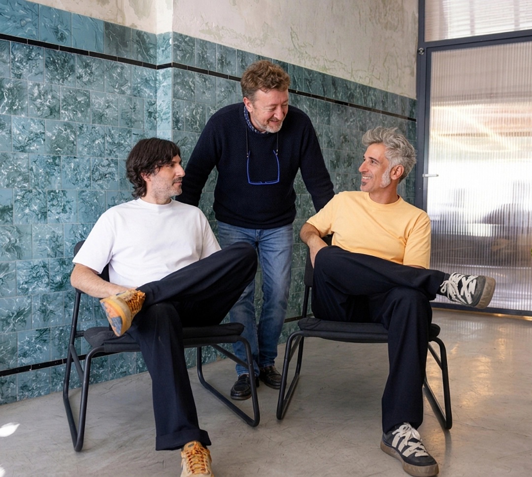
For this series, Rubio & del Amo, a Murcia-based studio specializing in visual identity, editorial design and packaging, joins forces with Cruz más Cruz, the Madrid firm founded by José María Cruz Novillo and later consolidated with the arrival of his son Pepe. Two fairly complementary sensibilities feeding into a common project. Rubio & del Amo brings conceptual freshness to the graphic tradition through which Cruz Novillo has helped define the visual identity of contemporary Spain. Cruz Novillo, for example, designed some of the final series of peseta banknotes immediately before the arrival of the euro, so his participation in this proposal establishes a discreet bridge between Spain’s monetary memory and one possible future face of Europe.
With respect to the proposal we looked at several weeks ago —and this is precisely why I am discussing it immediately afterwards— the entire graphic ensemble turns 90 degrees to the left and adopts a vertical configuration. The shift is radical despite the economy of the movement. No small thing. There is a fairly audacious declaration of intent in that decision.
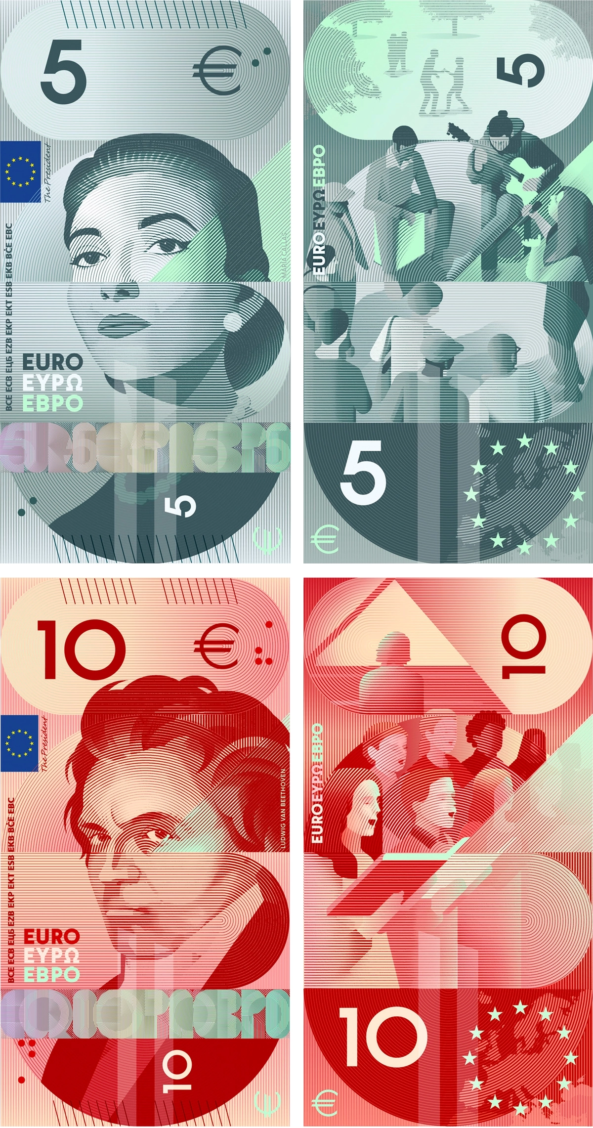
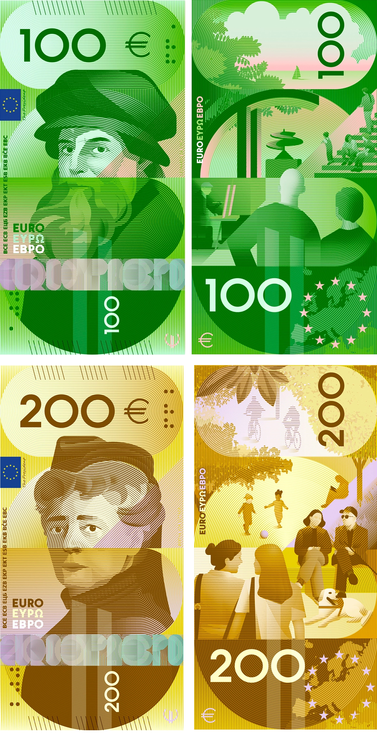
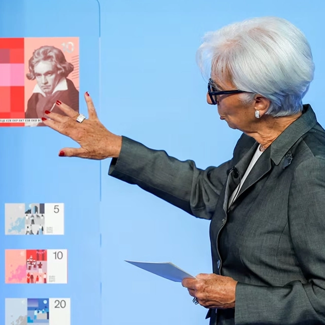
A second difference, one that makes me detect a certain Spanish, bullfighter’s pride, lies in the direct, at times defiant gaze of the great protagonists of European culture. I could not say whether their expressions were intentional or whether they simply came out that way. Beethoven looks at us with excessive suspicion, scolding and indisputably disapproving. I feel I do not deserve it. Something similar happens to me with Madame Curie. Her expectant gaze conveys far too much unease, as though I were about to spend those 20 euros on a pile of cinnamon doughnuts. Cervantes looks at us with disappointment, almost contempt, as though we were holding him in hands slick with chicken grease. Da Vinci much the same and, from the highest-denomination banknote, Bertha von Suttner regards us with an anguished kind of pity. Only Callas, from her five euros, seems to be at peace with me and with herself.
Everything seems filtered through a geometrizing compulsion, everything integrated into a rigid structure articulated by a dense network of lines running across the banknote in multiple directions. They cross, confront one another, retreat under a somewhat chaotic discipline. Every gesture is cancelled by the imperative logic of precision. The entire surface looks laser-cut. The bands, the typography, every signifying module seems to be the product of a mechanical mind.
This already strikes me as neither particularly Spanish nor particularly bullfighting in spirit. For a very long time, Spanish identity has insisted on an informal, carefree gesturality. On an aesthetic very much in the vein of Miró, very unburdened by inhibition. Perhaps these grids, moving like advances and retreats commanded by a drunken general, could be put to use by the security devices that will later be incorporated into the final printing of the banknotes, or as tactile identification elements and raised marks for blind and partially sighted people.
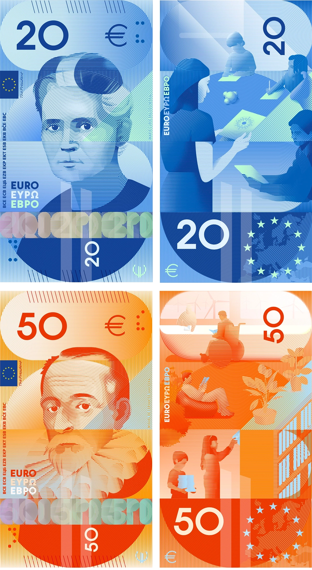
For those of us fortunate enough to enjoy the ability to see, colour will allow for quick differentiation. But the palette strikes me as somewhat saturated, especially the greens and yellows, at certain points almost fluorescent. They may prove effective in everyday use and also tire the eye.
The reverses, as in all the proposals, look like reverses. Although they retain the same formal system, they move toward collective scenes and rather indecisive cultural references. They give me the impression of landscapes, spaces enclosed within an architecture that has detached itself from reality, floating thousands of kilometres above a mud-soaked Earth. The scenes may display a certain playful and convincing exuberance, but they are betrayed by an almost orthopaedic restraint, by the overly precise administration of their elements. Everything seems to have limits, everything seems to be a closed circuit, nature tamed and predictable.
The human figures appear as flat, cut-out silhouettes, integrated into the same reticular system. The scenes are compressed to achieve maximum visibility within confined spaces. What should convey the practice and enjoyment of culture is entirely devoid of emotional substance. Everything looks newly installed. Everything circulates under a symbolic mission.
Its strongest point is its internal coherence. Every element responds to a common grammar. Lines, repetition, superimposition, contrast and rhythm. Unlike more illustrative designs, these seem to emerge from the banknote’s own language. They intimidate just enough. They convey security, seriality, pattern, printing, verification. The overall aesthetic insists on the technical character of money and turns that character itself into a theme.
The proposal is sophisticated and powerful, but also cold. The accumulation of grids can make some elements cumbersome to read and reduce the space for contemplation. Nothing invites us to look at the images. What it seems to propose instead is the deciphering of their underlying structure, their decryption. It understands the banknote as an instrument or graphic artefact. The pretty little holy-card business can wait.
In my opinion, what I find most complicated is the emotional distance that may separate it from organic, intuitive and sensory minds. The minds of almost everyone. I give it 8.2 out of 10.





If you’re a regular reader of this blog and enjoy its content, you might consider contributing to its upkeep. Any amount, no matter how small, will be warmly appreciated
Founded in 2021, Echoes (Notes of Visual Narrative) invites everyone to explore together the visual codes that shape our world—art, photography, design, and advertising in dialogue with society.

Copyright © 2026 r10studio.com. All Rights Reserved. Website Powered by r10studio.com
Cincinnati, Ohio


Comments powered by Talkyard.